Saturday, 30 November 2013

DIY Crafts // Making of the Bunting

This is an example of what the step by step photographs will look like throughout the manual.  This example is the bunting which I have been making for the project.  These images have since been edited by Emily in Lightroom.  


The materials you will need:


Cut out bunting triangles using the triangle template provided.  If you want to be eco-friendly and recycle / upcycle why not use old clothes which were originally deemed for the charity shop?  Using old clothes and old fabrics gives a shabby chic look to your bunting with all the mismatched materials.  Some of the fabrics here are from old clothes and some are from a bag of off-cuts I was lucky to find in Leeds Market at one of the many fabric stalls.


Get your bias tape and fold it in half lengthways.  Pin the bunting triangles inside the bias tape with the short edge at the top as you can see below.


Once you're all pinned up it's time to get sewing!  If you have a sewing machine then lucky you, this will only take a minute, hand - sewing takes a little longer but is well worth it in the long run!


Monday, 25 November 2013

Paperchase // Stamp


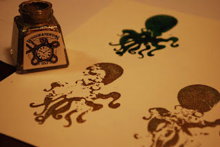
Here is the octopus stamp cut out from the laser cutter.  One of the men from woodwork cut out the thicker wood for me on one of the machines there and then I used the wood glue in the workshop to attach the pieces together.  


Just to experiment I cut out a hole at the top of one of the octopuses as I thought if I were to extend the range (as paperchase often do) I thought the octopus might make for a good key ring or hanging decoration.  


Here is the mocked-up stamp I have created.  I think that it looks professional however if I could have sourced some rubber or if I was doing this in real life I would have liked to get the octopus cut out of rubber so that it works better as a stamp.  The wood works but is not quite as effective as the rubber.  There are websites online where you can get your own personalized stamp created and posted to you, however due to the illustration it priced up to be much more than I could afford.


 The ink pad I ordered offline was a bit disappointing in quality as it is a fabric one (which I have never seen before).  For the example the stamp worked better when real ink was applied.


To incorporate the ink pad more into the design of the stationery set I have given it a cover to fit in with the design.

Wednesday, 20 November 2013

Hannah's Place // Business Card Development

Idea One

The client wishes the design to feature purple as it is a strong and cosmic colour.  The watercolour effect here breaks up the purple and looks more soothing than just solid colour.  The illustration is the simplified peacock illustration.  The client also desires peacocks to play a part in the design somehow.


Idea Two

The healing hands with the peacock feathers featured here.


Idea Three


Idea Four


Dr Me Says Create a Flag // Partner Luke Rossiter

I thoroughly enjoyed the day and came away feeling really positive instead of a bit worried about moving on into the industry.  The quick turn around made it exciting and being partnered with Luke, who I'd not usually collaborate with went well and we came up with a good concept.

We starteed off by each listing five things that we liked:

Me:  Cupcakes, Illustration, Patterns, Vintage Furniture, Dub Music

Luke:  Aircrafts, space, science

After talking through idea's and looking at artwork which inspires us both we came to the idea of Ganesha which is "The patron of arts and sciences and the deva of intellect and wisdom."

As soon as we realised this elephant god was to do with art and science it got the ball rolling quicker.

We considered things which were considered both art and science:
  • Flower of Life
  • Fibonacci Sequence
'This step by step tutorial illustrates how to draw a simple Flower of Life.  The Flower of Life is the blueprint of creation. It contains within it all geometric forms. Among other things, it is a symbol for the interconnectedness of all things.'


Fibonacci Sequence - this is used in art and is quite scientific:


Monday, 18 November 2013

DIY Crafts Day with Emily

After all the planning for our book, the planning of what crafts we're going to make and what's going to go where, on Saturday we finally started crafting.  We did a full day of crafts, set up our living room like a studio and we both feel like we made great progress.  Working together was exciting as we were constantly bouncing idea's off each other and helping each other out.  Both of us each doing our own crafts and photography we also shared the role of. 


Our basement/living room which we otherwise use very rarely worked perfectly as a creative space.  We felt that we could use the week off college to our advantage and did not want to set this up in the studio at college as it would probably annoy others and get in the way.

Over the course of the day we got lots of things ticked off our list and we shall hopefully be able to begin designing soon.  Emily will be taking lead role in the editorial side, while I will be taking care of any illustrations needed or any hand-rendered type.

Here is an example of what one of our 'How To' crafts tutorial pictures will look like:


I am happy with the owls I created, these will be one of the harder crafts to complete in the book.  To keep in theme with the recycling and upcyclin, all the fabrics I have used were scraps from the recycled bunting project which I undertook last year.  As you can see, I have used an asda bag to stuff the owls, which is recycling and probably better for the planet than going out and buying toy stuffing.

A thought to bring up with Emlily:  Perhaps the craft idea's should have a difficulty rating?

The images will be edited before being placed in the book as a few of them are slightly dull.  We have stuck to what people said in our crit feedback of keeping the 'how to' photographs simple and on a plain background.  We are pleased with the way they have turned out.


Here is a link to a GIF which I created (practice run of a possible stop frame animation (need a tripod))

file:///Users/nicolaproctor/Documents/3rd%20Year/DIYCrafts/GIF/owl.gif 

Thursday, 14 November 2013

Design Boards

Below are some design boards which I took with me to the crit today, I also need to upload images of the practical which I also had to show.


Crit Feedback

Paperchase


1)  Do you think I should carry on the range further and apply it to more products?
(Planned/existing products - greetings card, headed paper, envelopes, stamp, sketchbook)
  • If you wanted to extend it then you could look in paperchase at how a range has been created from one pattern/image, will give you more outcomes and will probably make it stronger.
  • Children:  Colouring in posters, laser cut stencils
  • Older:  Make and female, consider unisex colour scheme to appeal to both audiences 
  • Add a story?  Which can help boost the range
  • Possibly look at using the illustrations on fabric based products - pencil cases, laptop cases, could experiment with tie dye effect
  • I think the range should be extended as visually the work looks strong, really like the illustrative style and use of colour.

2)  Do you think the illustration looks better applied to the white textured stock, or the colour background?
  • I think the octopus should be used for the design/pattern of product & logo should be a title of the range.
  • Illustrations look clearer on white stock 
  • I really like the illustration applied to a colour background!  Looks great, tie dye effect.
  • I'm unsure about the theme, although the white prints would make dope cards! 
  • Preference to white, although dropping colour in the illustration could work
  • It is clear on white but much prefer the textured coloured background works well with the sea theme.  Would it be possible to use a thicker outline or leave octopus white?
  • I think both work really well, the white post cards look good with texture, really like the book, colour suits illustration.

3)  Does the logo need text for it to work?
  • Identity works well as illustration alone, consider different printing methods such as screen print.
  • Have you thought about scale with the logo?  Maybe try a silhouette (due to detail)
  • More understandable but it is just seen in paperchase it is obvious it would be stationery set design, could also limit products if strictly just stationery.
  • You could apply text but I don't think it's necessary

4)  Target audience?  Do you think it could be appealing to both genders?
  • Female Audience Only
  • Predominantly female
  • Maybe expand into a larger range of illustrations so a larger audience are more likely to relate.  Appropriate for a wide range so this is good.
  • I think the image itself could apply to both genders but colour and the fact it is stationery means it appeals more to a female crowd
DIY Crafts


1)  Does the stitch effect for the front cover work?  (It will become digitalized)
  • Great start, like the hand stitched approach.
  • Love the stitching/ hand made aesthetic, works really well
  • Stitch is legible but to make it practical for use you have to scan
  • Clear indication of crafts, works well
2)  Do you think people would be interested in a DIY craft manual?
  • DIY is very popular, a lot of info is online however a playful manual would seem useful if designed well, make it very appealing!
  • Yes there would be an audience 
  • People would be interested because its currently on trend
3)  Do you think hand-rendered type could work well, overlayed photographs?
  • Unsure about hand-rendered type on photo's, perhaps white text on a dark image.
  • Yes, dependant on style of both


Tuesday, 12 November 2013

Paperchase Stationery // Preparing Octopus for Laser Cutter

As I intend to make an Octopus Stamp to go inside the Stationery Set, I have booked a laser slot today to experiment with the stamp, as I haven't used the laser cutter since the end of second year I hope I'm not too rusty!

Below you can see I have simplified the drawing down.  The drawing must be simplified from the original, If I wish to cut it out of wood.


Below is the simplest version of the octopus:

Once I have seen what the outcome is like I will then decide whether to try and add more detail or not.


Monday, 11 November 2013

Paperchase Stationery // Stamp


Above is a quick design sheet of my working out of how to create the stamp on the laser cutter.   I was originally going to send away for the stamp to be manufactured professionally, however when it actually came down to it, it was going to cost between £30 - £40 instead of free on the laser cutter!

DIY Crafts // Chrismtas Paperchains


The Christmas Paper Chains are going to be an insert within the book, not a step by step tutorial guide like the majority of the crafts within the book.  This gives me an opportunity to develop some illustrations to be applied to the paperchains, which hopefully be a perforated interactive section of the book.


DIY Crafts // Possible Logo Idea's

We have decided that having a logo for our product is an important feature, and we have decided that it's a good idea incase we want to take the range further in the future as this is a brief that we are both extremely interested in and are very excited about it.  We want the logo to incorporate the crafty/home/hand made feel while also keeping it clean and professional.  We both think the 'stitched look' suits the manual but I am going to develop a few idea's further and then seek feedback from Emily and other members of the class.


DIY Crafts // Plan

Emily and I have began by breaking down the roles we each are going to take for the making/designing of the DIY Craft Manual Book.  We have also sectioned off all our different idea's for home made crafts into sections to make the book easier to read and understand.


 We have also decided to dedicate Monday's and Tuesday's to this brief in order to get it finished by Christmas as the book has a Christmas Section and we think it would make a really nice gift idea.

We have been discussing the brief regularly and have decided that a book like this would suit a more colloquial language, we would like it to be more personal and engaging to the reader and less formal.  We feel that this would make it enjoyable to read.  I have an example of language used like the from an Abel & Cole Recipe Book which I received with the first veg box I got from them.  The book is written in a way that you feel like the writer wants to be your friend, and very helpful, rather than the formality found in other recipe books I have seen.  (Also Abel & Cole is a very successful business in organic fruit and veg).

((Scanned image of example))

We intend to each tackle the crafts between us, while Emily takes the role of the editorial part and the majority of finalized copywrite, while I take the role of illustrator, logo designer and product placement for the photography shots (which we both will be involved with.)

Wednesday, 6 November 2013

Hannah's Place // Initial Drawings for Logo and Business cards

On our second meeting I prepared some drawings surrounding the words and themes which Hannah had given me on our first meeting.  She really liked the peacock illustration as it embodied the concept of 'The peacock being a possessor of some of the most admired human characteristics, and is a symbol of integrity and the beauty we can achieve when we endeavor to show our true colours.'


Further research led me to understanding more the symbolism of the peacock:

'In history, myth, legend and lore, the Peacock symbolism carries portents of: Nobility, Holiness, Guidance, Protection and Watchfulness.  Contemplate the powers of the Peacock when you need more vibrancy and vitality in your experience. The Peacock can also help you on your spiritual Path, and breath new life into your walk of faith.' http://www.whats-your-sign.com/peacock-symbolism.html


The healing hands


A couple of different idea's for how the logo could look.


The client would like me to progress with the peacock concept.

Paperchase // Logo Development


Paperchase Stationery // Logo

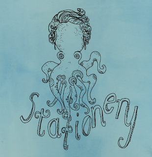
Initially I have been attempting some hand rendered typography which I have already spoken about in the visual research board.  Below are a few initial idea's.


To try and digitalize these once again, I have used the wacom tablet, a few examples of what digitalized versions look like:


A further design sheet for the possible logo idea.

The idea's below have more of a nautical theme going on.  I think it is important to have the octopus in the logo.