Friday, 20 December 2013

Hannah's Place // Further Peacock Symbolism Research

Symbolic Peacock Meanings

  • Glory
  • Vision
  • Royalty
  • Spirituality
  • Awakening
  • Immortality
  • Refinement
  • Incorruptibility
In Greco-Roman mythology the Peacock is identified with Hera (Juno) who created the Peacock from Argus whose hundred eyes (seen on the tail feathers of the Peacock) symbolize the vault of heaven and the "eyes" of the stars. 

In Hinduism the Peacock is associated with Lakshmi who is a deity representing benevolence, patience, kindness, compassion and good luck.
Similar to Lakshmi, the Peacock is associated with Kwan-yin in Asian spirituality. Kwan-yin (or Quan Yin) is also an emblem of love, compassionate watchfulness, good-will, nurturing, and kind-heartedness. Legend tells us she chose to remain a mortal even though she could be immortal because she wished to stay behind and aid humanity in their spiritual evolution.
In Babylonia and Persia the Peacock is seen as a guardian to royalty, and is often seen in engravings upon the thrones of royalty. 

In Christianity the Peacock symbolism represents the "all-seeing" church, along with the holiness and sanctity associated with it. Additionally, the Peacock represents resurrection, renewal and immortality within the spiritual teachings of Christianity. 

Themes of renewal are also linked to alchemical traditions to, as many schools of thought compare the resurrecting phoenix to the modern-day Peacock.


Thursday, 12 December 2013

Paperchase // Final Photo's post Crit Feedback

After presenting work to peers in two of the organised critiques I received feedback mainly from the paperchase brief.  People like the illustrations but many thought the designs lacked colour.  Also the box which it was presented in looked unfinished and unprofessional.  I completely agreed with this feedback, personally thinking it looked like a cake box from the old bakers I used to work at. 

Feedback also suggested that the stamp and ink pad looked slightly unfitting with the rest of the work.  I decided that I could use these as a mock up of what I would propose to be designed and produced more professionally than I could do it using the college resources.

I also decided that it was important to give the outcomes more of an identity.  You can see how I furthered the design outcome in the image below:


1 x sketchbook
3 x greetings card set

The range now only has these two outcomes.  It looks so much more professional now though.

Alterations: packaging and presentation of the pieces, and 'okto greetings card' identity.

DIY // First Set of Design Boards


Illustrated Veg/ Veggie Recipe Cards // Design Boards


Hannah's Place // DR Me // Design Boards

Initial Design Boards Submitted at Christmas.


Papercahse

Evaluation:

This was the first brief which I carried out in Level 06.  Looking back I did spend quite a lot of time on this brief as I was experimenting with my illustration style and practicing free hand illustration while also using a Wacom tablet for the first time to create the final octopus illustrations which you can see applied to the greetings cards and notebook.

When I submitted the brief at Christmas, I submitted more outcomes, which didn’t look particularly good together as a set.  I also photographed the work in my living room with poor lighting, which really did not do the outcomes justice.  When photographing my other work for the yearbook I decided that I really needed to refine this project because it was letting my overall portfolio down.  I went on to package and apply branding to the pack of greetings cards.  I also photographed my work with a good camera and lighting hired out from the photography department.  After doing this I was so much more pleased with the final outcomes and felt that it was then good enough to put into my portfolio and finish off my design boards.

Dr Me // Evaluation


Evaluation:

When Dr Me came in to do a Live Brief with us, I really enjoyed the way that we worked.  I was partnered with Luke and our design styles are really quite different but together we managed to come up with a concept that encompassed both of our interests.  Unfortunately with everybody printing and using the digital fabric printers we did not manage to get a slot in time for sending the flags off to exhibition.  This taught me to remember to book things in advance to avoid disappointment.  It was fun working to a strict deadline with a quick turnaround and I would like to work like this again in the future.

Wednesday, 11 December 2013

Illustrated Veggies // Final Photograph of Product with Ribbon


Illustrated Veggies // Recipe Cards // ISSUU

Illustrated Veggies // Front Cover Card Design

I like the layout of the vegetables here however the text is just not working and does not stand out enough against the illustrations.


The design below is too similar to the actual recipe cards.  It was my initial idea however it is too simple and similar and could get confused amongst the cards.


This card is different enough so that it is easily recognisabley the front cover design.  The colours compliment each other and the label with the text on makes the name of the product stand out more.


Illustrated Veg // Design Decisions

I made the decision after speaking with peers in the class to get rid of the recipes and replace them with lines so that people can fill in their own favourite recipes.  We feel that this would create a much better gift idea for food lovers/ vegetarians.  I think it will also appeal to people more if they can have all their favourite recipes kept together on some lovely cards rather than recipe idea's which I have suggested.


Illustrated Veggies // Final Designs

The results of the mixed media printing has worked well and I feel that it has given my work a different but positive look.  My illustrations are often black and white so I feel that the overall look of them has been improved with the splash of colour.

These designs feature soup recipe idea's however after discussing with peers in the class, we feel that the recipe cards would appeal to a wider target audience if the cards were blank and you could fill them in with your own recipe's.  This means that it made sense to get rid of the typography used on the front of the cards to reduce the limitations.  The new designs will have simple lines where people will be able to write their own favourite recipe idea's.


Illustrated Veggies // Border Experimentation


I thought it was important to experiment with a border for the cards to see if it improved the design at all.  However I feel that the border creates unnecessary clutter on the page.


Illustrated Veggies // Vegetable Illustrations


Friday, 6 December 2013

Illustrated Veggies // Development of Design Layout

Intitally I thought it might be a good idea to scan in some coriander, as it was difficult to print with.  I will however not be using this image as it reminds me of a dodgy microsoft word clip art and actually the design generally works better without it as it is too cluttered with the coriander.


Also initially I was going to put the ingredients list on the front of the card and the 'preparation' on the back.  This layout was still too cluttered and feedback from the crit people agreed and said there was just too much going on.


 Feedback from the crit also said that people thought that the overlaid illustration over the print was much stronger than the print alone.  This feedback I was happy with as I thought the same, I then progressed onto drawing up the remaining illustrations to go along with the prints.


It also seemed to make much more sense for the cards to actually be landscape, as the back of the card was probably going to be landscape for the functionality of the text and how it is read.  For the composition of the majority of the designs it also works better than portrait.


Thursday, 5 December 2013

Illustrated Veg // Hand-rendered typography

To fit in with the style of the illustrations and the whole write your own recipe idea's, I have written and scanned in some hand - rendered type.  You can see the texture/colour on the left on the image and the hand-writing on the right.


To create the hand-rendered type below, I scanned in my hand-writing and then live traced in illustrator.  I then used clipping masks of the letters over the colour/texture background so that the text would have a nice texture to it and the colouring would fit in with the illustration.

I think it looks good and works well with the style and the design however it was just becoming impossible as the file size of the document was far too large for my computer and if I was to design each recipe card like that I was beginning to worry my laptop would crash and/or something would go wrong when going to print in the dungeon with James.


Wednesday, 4 December 2013

Illustrated Veggies // Printing the Veg

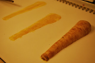
To create the artwork for the vegetable recipe cards, like stated in the brief I have been experimenting with mixed media techniques.  As you can see from the images below I have been using vegetables to print with and the outcomes that I have produced I am pleased with.  


Some vegetables for example, the carrots work really well to be printed.  Unlike the pepper which you can see a print of below, the print does not have as good quality as that of the carrot.  To create the prints I have been chopping the veg in half and printing like that.  Therefore for some of the prints, I have gone on to do a painting of them, still using the acrylic paint which makes the effect similar.


The broccoli I was quite looking forward to using as it was my original idea for using it to print.  This veg worked perfectly for printing as I could paint the inner stalk and print with that and then use the top of the floret dabbed in paint to create the same part on the print.  (hard to explain but you may see from the picture)


Celebration Squash- this veg did not work quite as well for printing so I then did a painting of the squash as well to compare and see which worked better overall.


Left is a print, Right is a painting


Parsnip


Mushroom

For the mushroom, there is a mixture of printing, painting and also a collage (which will be scanned in) of a print & stalk of a real mushroom.


The mixed media printing has worked well, and the prints have scanned in really well which means they will be easily edited on photoshop.